Project Overview
Workspace reservation
Ensuring a smooth transition as employees return to the office
The project aimed to improve the Workspace Reservation Platform by conducting qualitative and quantitative user research to design a more user-friendly and efficient application, prioritizing usability heuristics and user experience. This initiative was in response to Medtronic’s early 2022 policy requiring employees returning to the office under COVID-19 restrictions to reserve workspaces via the Facilities Services platform. The goal was to improve the platform to ensure a better experience for employees navigating these new requirements.
Role
UX UI Designer
Timeline
Fev 2022 – Jun 2022
Stakeholders
- UX Designers
- UX Researcher
Problem
No user-friendly platform
Medtronic provides a platform for workspace reservation, but it is not user-friendly, and there are many issues in the user flow.
Outdated design
The platform features an outdated design and includes elements that no longer align with the latest user interface design principles.
Room reservation currently unavailable
The exclusive method to secure an office room reservation is through the utilization of email.
How might we design the employee experience so that people feel more productive and engaged?
Outcome
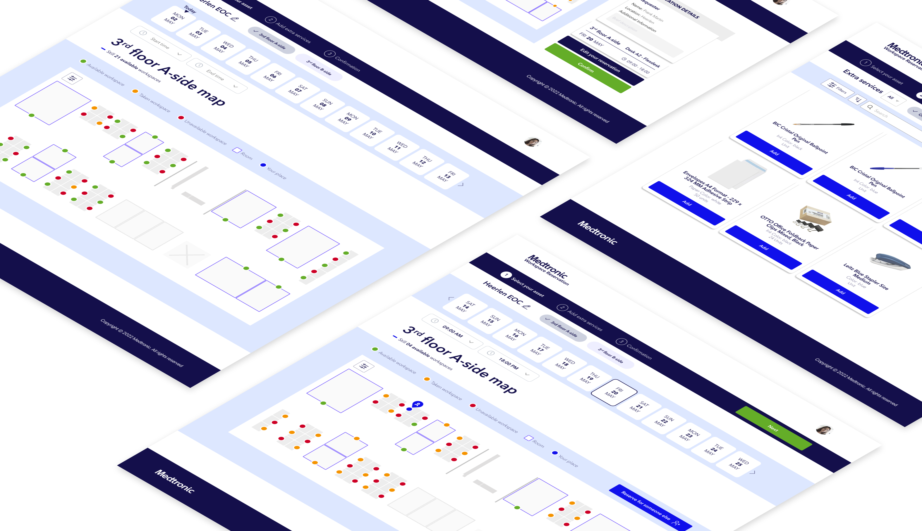
The new application features an interactive map showing available and unavailable desks, allowing employees to easily reserve workspaces and book rooms. The streamlined design improved the reservation process, making it faster and more intuitive. This led to higher adoption rates, increased satisfaction, and a more organized work environment, confirming the success of the redesign.
The solution

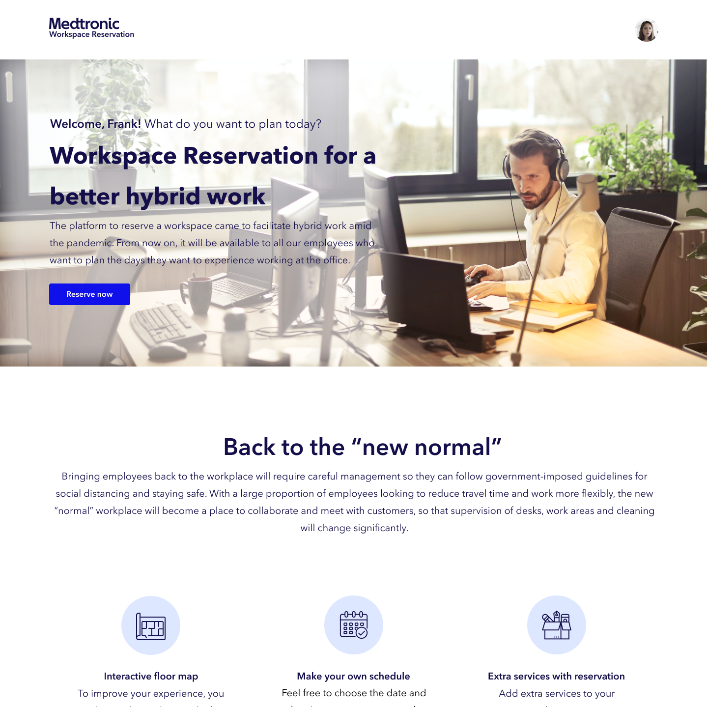
Redesigned homepage
the gateway to essential info and services
The new homepage improves user experience and functionality, focusing on delivering essential information more effectively. The updated layout prominently features key sections where users can easily access office rules, important announcements, and the latest news related to the workspace. The clean, intuitive design prioritizes clarity and ease of navigation, ensuring that relevant updates and general information are more visible and engaging for all users.

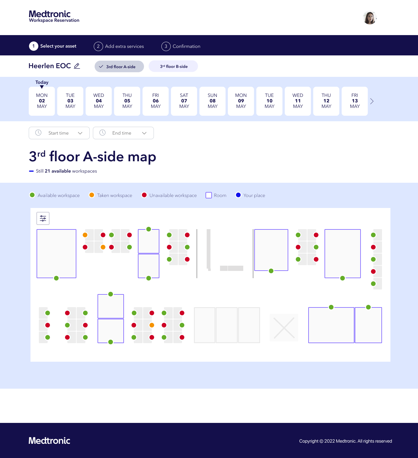
Interactive map
for effortless booking
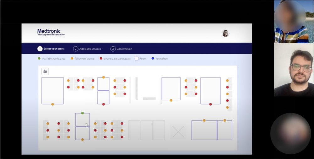
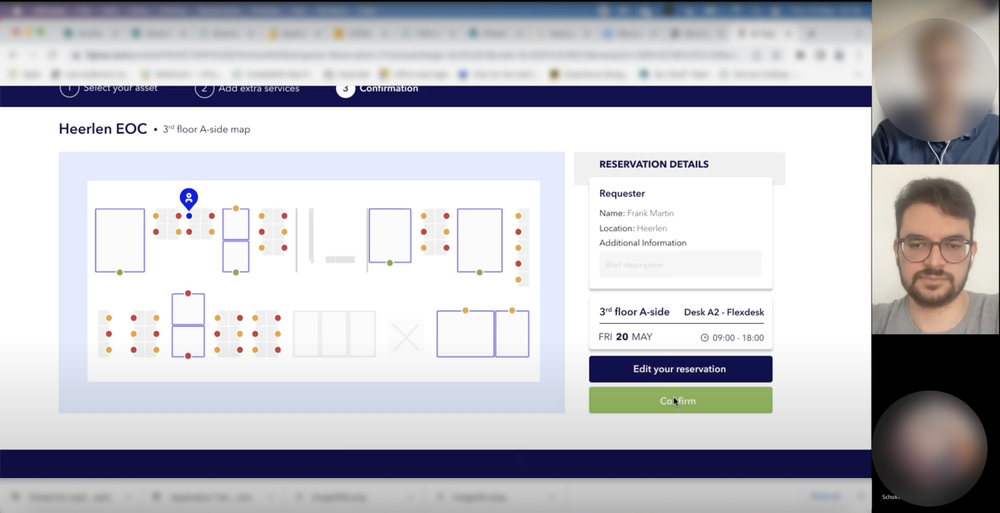
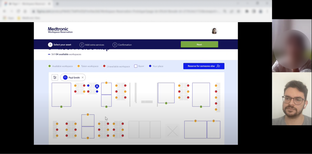
An interactive page featuring a dynamic map that allows users to visually explore and select their preferred workspace with ease. The map provides a clear and immediate overview of available areas, helping users make informed choices by displaying real-time availability and detailed information about each workspace. This user-friendly design enhances the decision-making process, making it more intuitive and efficient by enabling quick navigation and selection through a visual interface.

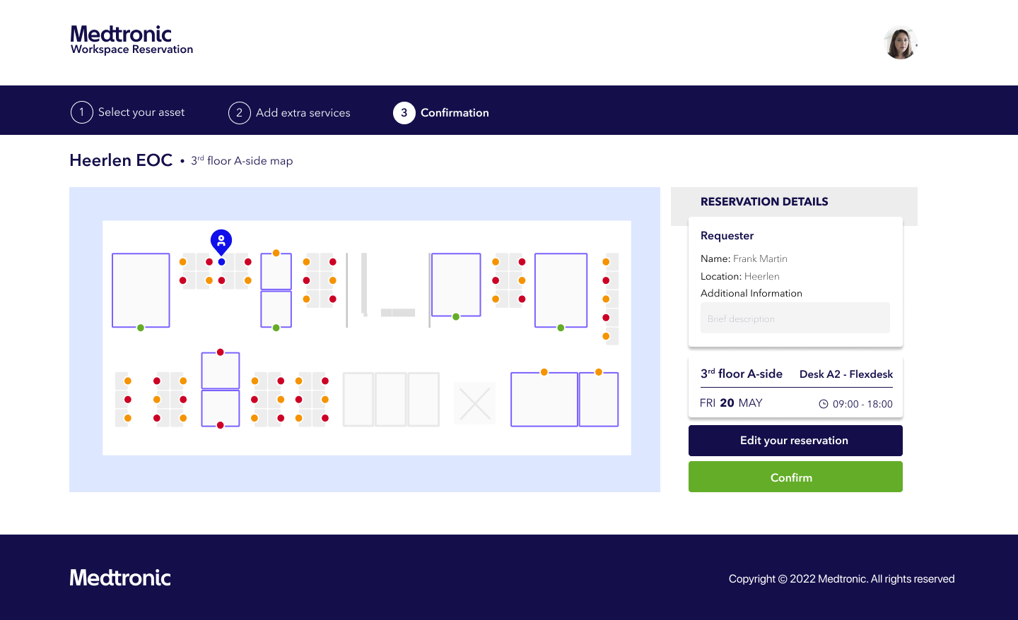
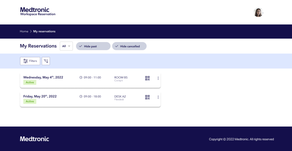
Streamlined
workspace reservation experience
Improved heuristic elements of the workspace reservation system to significantly improve usability and elevate the overall user experience. By refining key design principles like clarity, consistency, and feedback, the reservation process is now more intuitive and user-friendly. These improvements simplify navigation, reduce friction, and make it easier for users to complete their reservations quickly and confidently. The result is a smoother, more satisfying experience that meets user needs while aligning with best practices in UX design.
Exploring the workspace reservation platform
Understanding
the current workspace platform
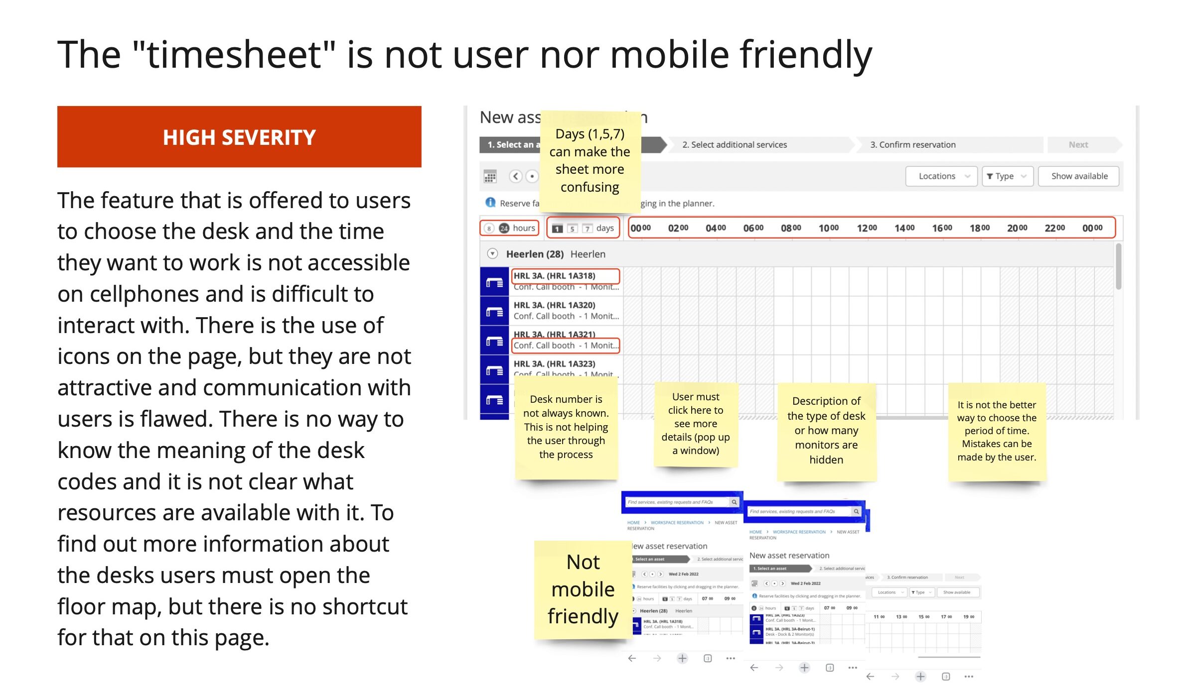
As I explored the Topdesk Facilities Services platform, I found it facilitates various office-related tasks, including reporting issues, registering visitors, and reserving workspaces. Focusing on the reservation feature for my project, I identified several usability issues and strengths. I conducted an expert review to systematically evaluate these issues and their impact on the reservation process.

Evaluating the usability
of the platform
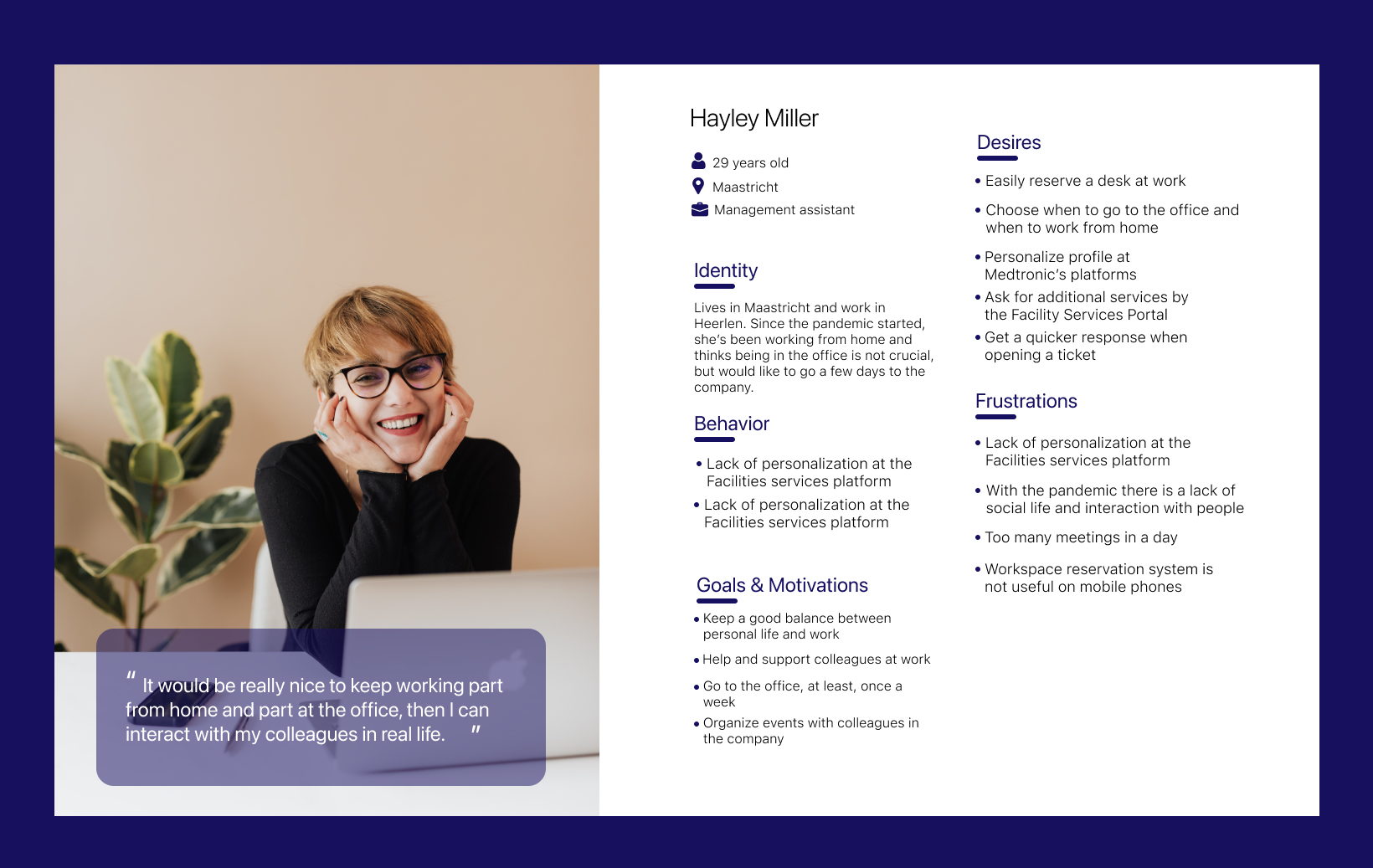
To understand the IT employees’ onboarding experience at Medtronic, five interviews were conducted to capture users’ feedback and insights. These interviews helped inform product development and design decisions, ensuring that the new platform aligns with the needs and expectations of the target group. This investigation was crucial to understanding the employee’s experience with the onboarding process and their current challenges.
Understading the users
& pointing the main concerns
Conducting usability testing and actively engaging with user observations and feedback are crucial for UX research. These practices are essential for developing a truly user-centered application, ensuring that it effectively meets user needs and addresses their challenges.
Mapping the path
to user satisfaction
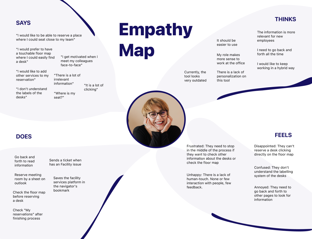
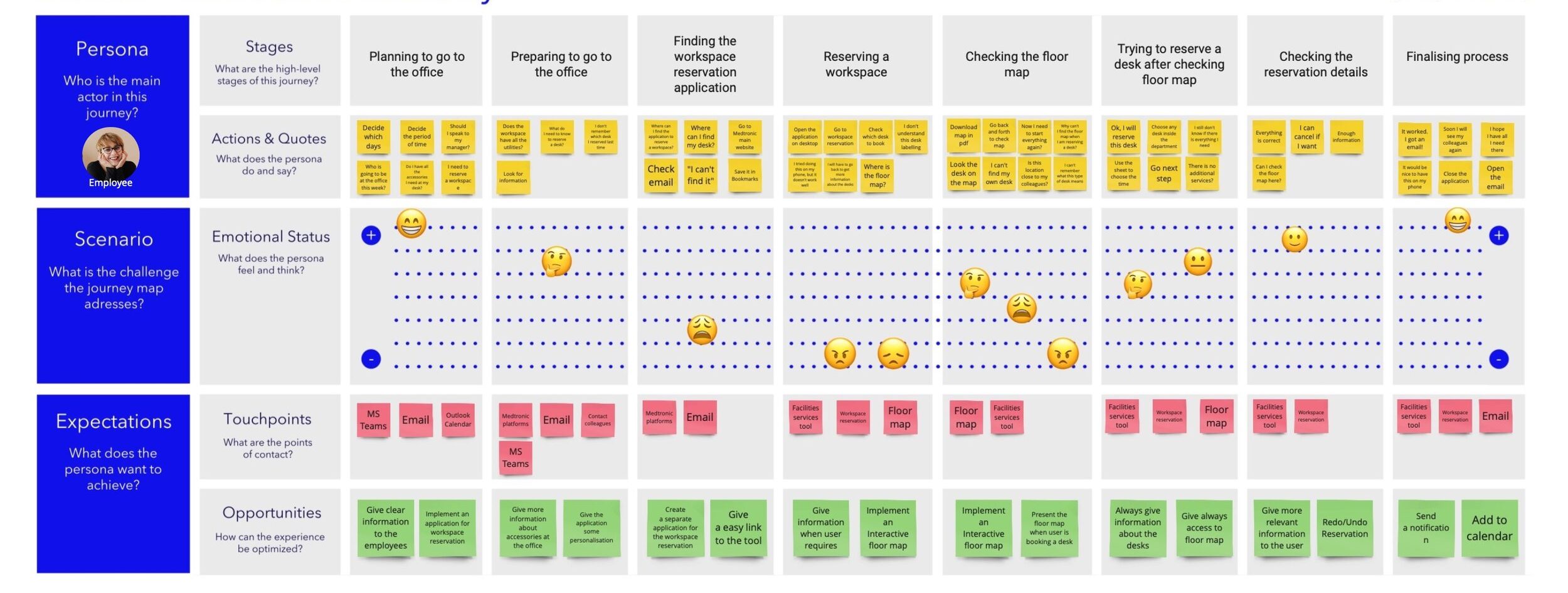
With the results in hand, I began planning improvements to address user pain points. Key issues identified included an outdated design, poor user experience, and the lack of an office map, all of which hindered usability and user interaction. To better understand these challenges, I created a user journey map to pinpoint where users faced difficulties and their emotional responses throughout the process.
Brainstorming, Ideating & Designing
Low fidelity
wireframes
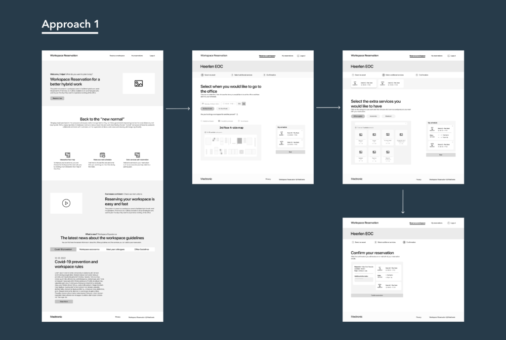
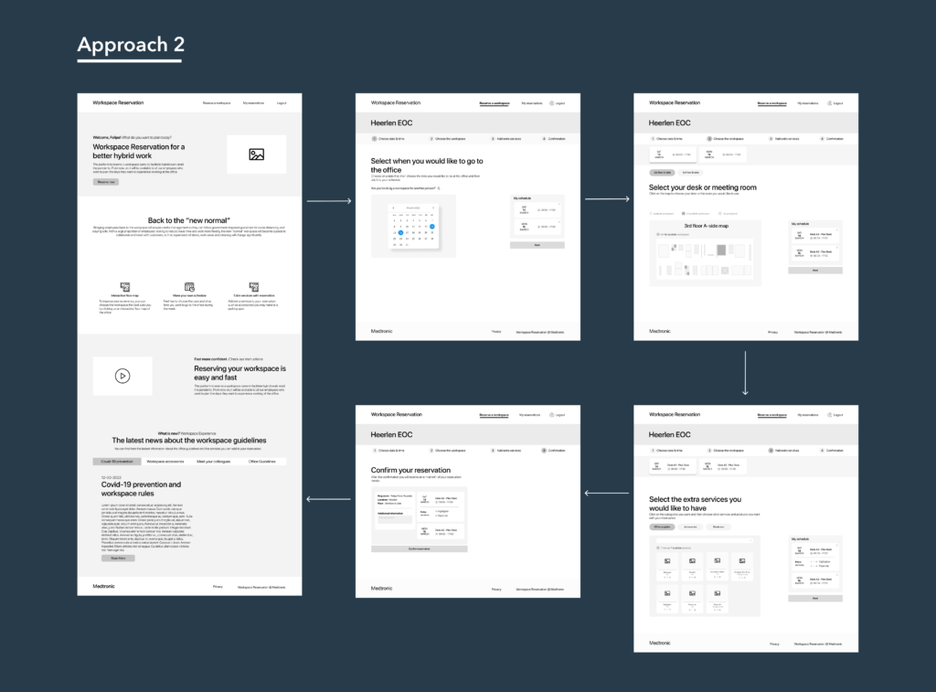
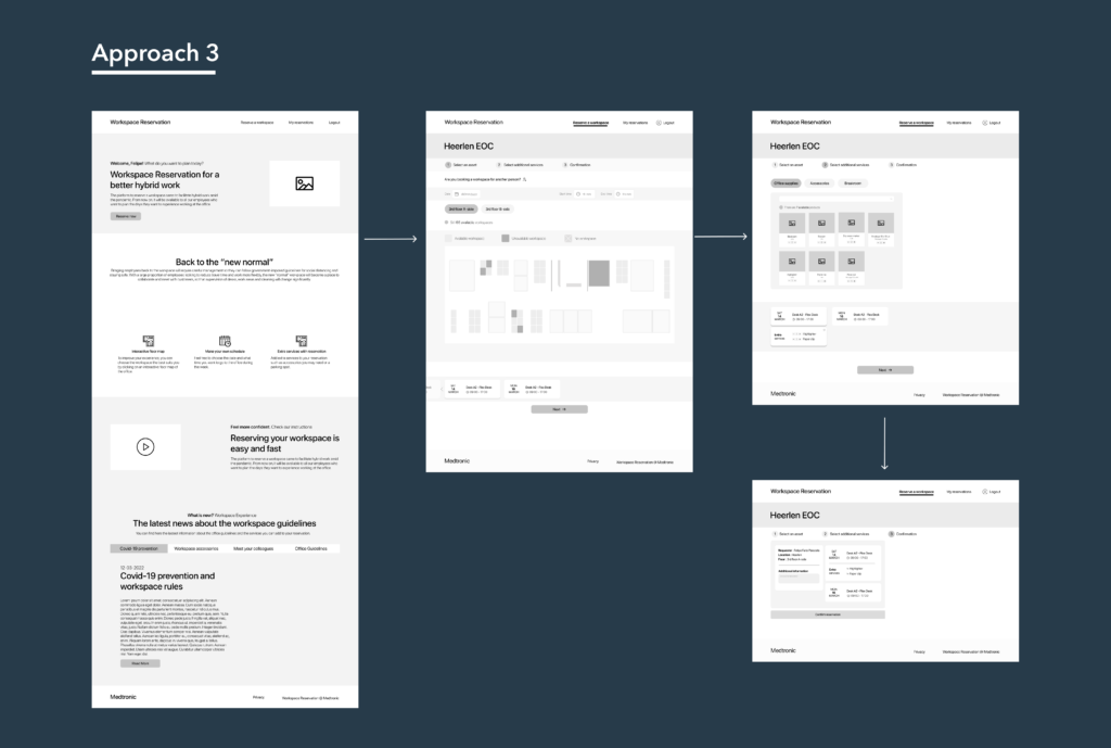
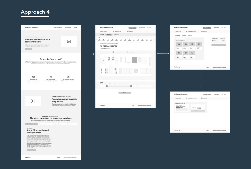
I developed wireframes featuring four distinct user flow approaches to explore how employees prefer to interact with the workspace reservation platform. The objective was to generate multiple design concepts and, ultimately, integrate the most effective elements into a cohesive final design, aligned with user expectations.
High fidelity prototype
and testing the new platform
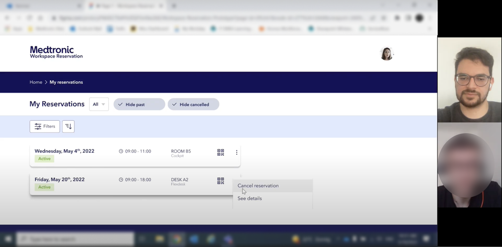
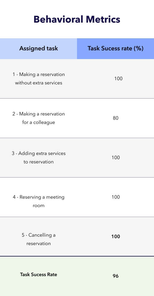
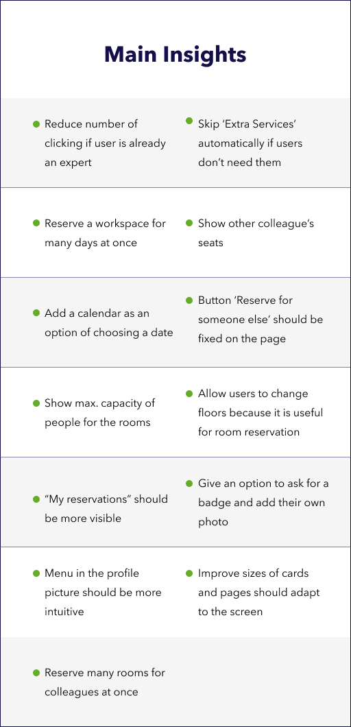
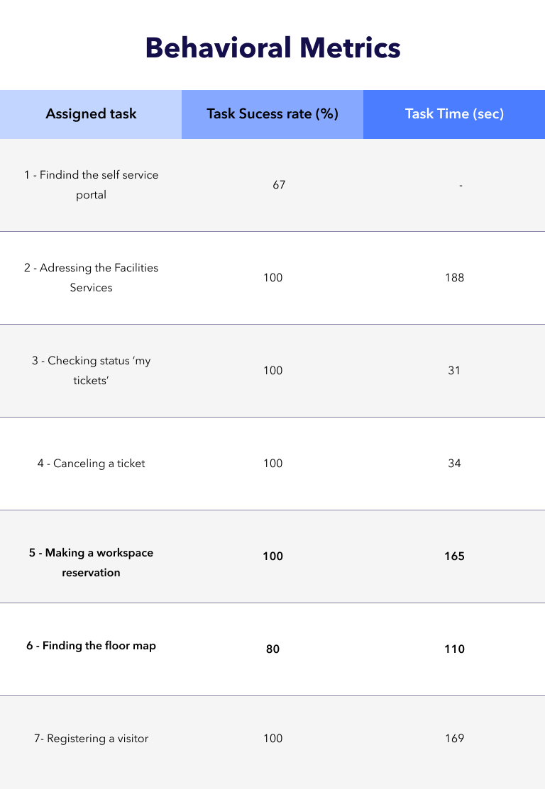
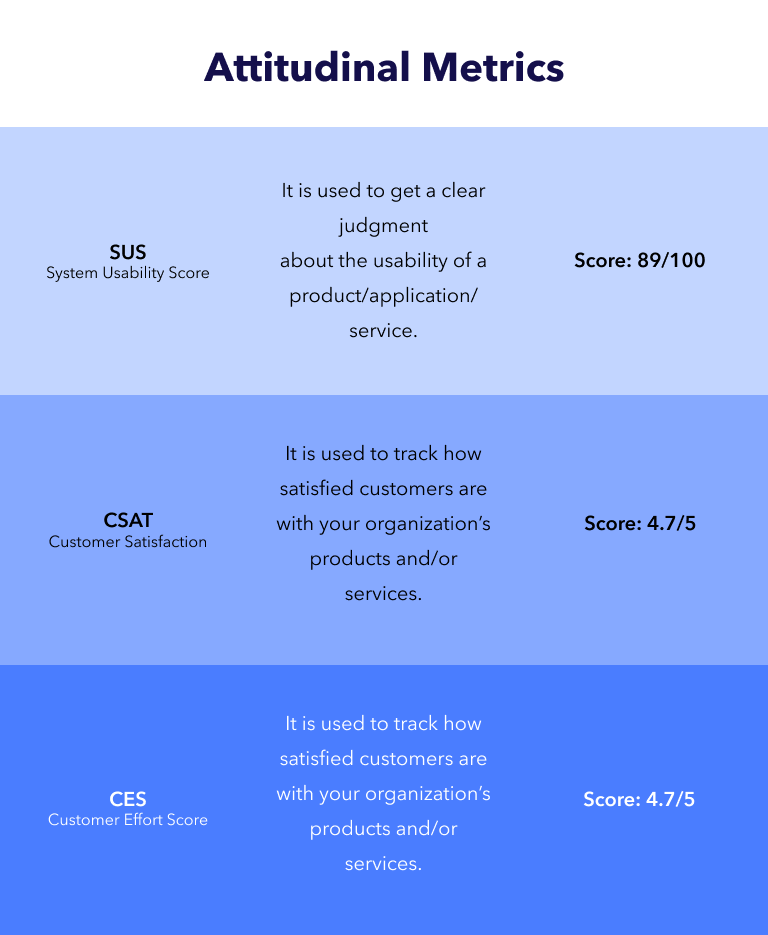
In this phase, I designed a high fidelity prototype and tested it with real users to assess behavior, needs, expectations, and overall satisfaction while evaluating the tool’s usability. The goal was to gather feedback from Medtronic employees on the new design to determine whether it meets user expectations and resolves existing issues.
