Project Overview
Medtronic Onboarding Platform
Providing a more interactive way of onboarding employees
The project involves conducting qualitative and quantitative user research to develop a design for the Medtronic onboarding platform, considering more user-friendly UI practices, usability heuristics, and user experience.
Role
UX UI Designer
Timeline
Fev 2023 – Jun 2023
Stakeholders
- UX Designers
- UX Researcher
- Onboarding Program Owner
- Front-end Developer
Problem
No specific onboarding platform
Medtronic does not provide a specific platform for onboarding new employees, although they provide a learning hub and other portals.
Lost with so many portals
The company provides too many portals, platforms, and documentation for various employee services.
New platform for employees
Medtronic has been developing a new platform that will concentrate all crucial links and services for IT employees.
How might we create an interactive platform that facilitates employees at Medtronic to increase their understanding of the onboarding process and enhance their awareness of the progress and sense of belonging?
Outcome
I designed and structured a new onboarding platform for new employees, making the process more efficient and interactive. This platform better prepares new hires for their roles, reduces their frustration, and increases awareness of the onboarding program and employees’ progress.
The solution
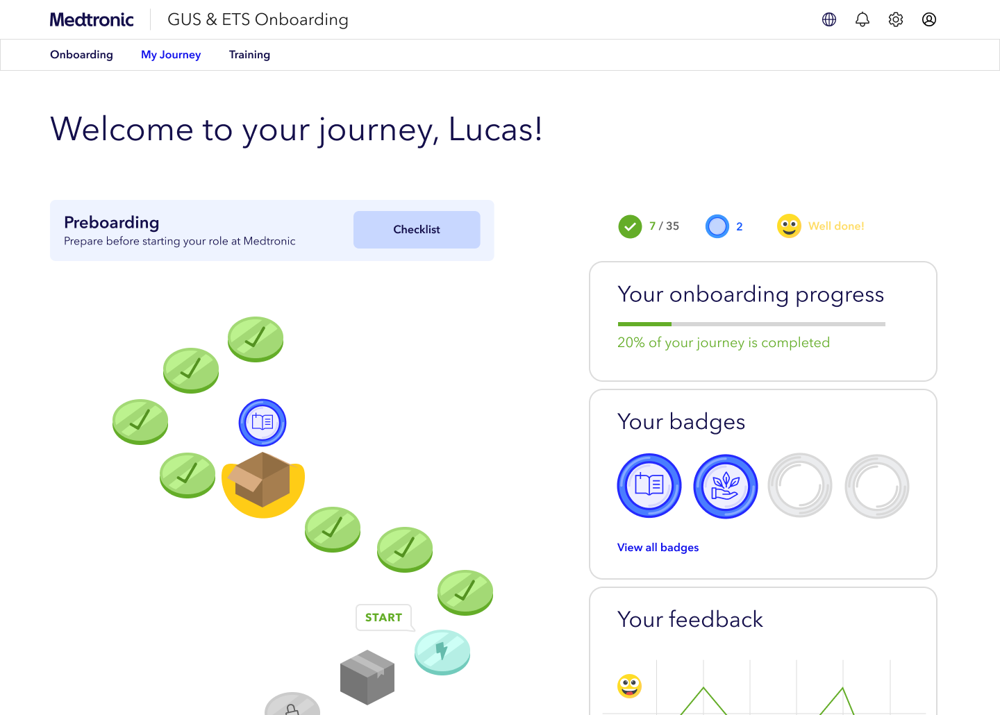
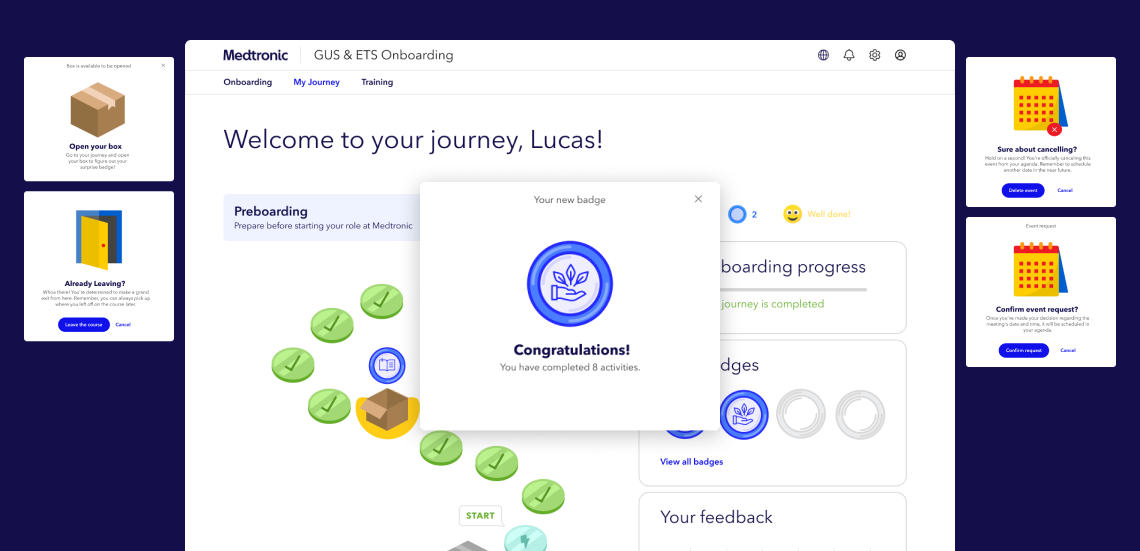
Personalised
onboarding journey
The onboarding program’s awareness and overall progress significantly improved with this platform. This success can be attributed primarily to implementing an interactive onboarding journey, which has greatly facilitated the visualisation of the onboarding process within the company.
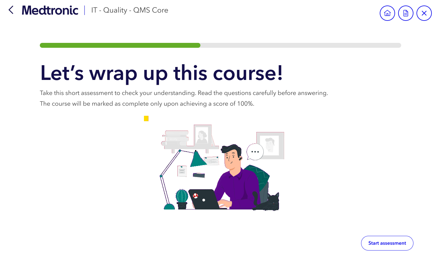
All training
in one centralised platform
The platform consolidates all onboarding activities, events, and training courses into one cohesive space. This centralised approach enables users to easily access everything they need. By completing training in this unified environment, users gain a clearer understanding of their journey. Additionally, the platform’s enhanced interactivity and engagement further enrich the user experience.
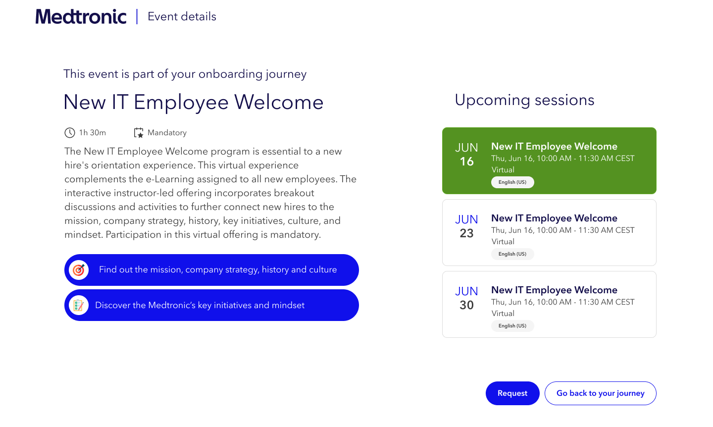
Awareness of
onboarding events
New employees can stay informed about mandatory onboarding sessions and events through the platform. They can easily confirm their attendance and add events to their agenda, which enriches the onboarding experience as it becomes an integral part of their journey into the company.
Exploring the Onboarding Process
Understanding
the onboarding process
To kick off my internship at Medtronic, I arranged a detailed discussion with the Onboarding Program Owner. We reviewed Medtronic’s onboarding program and the various channels through which employees receive onboarding content. This meeting provided me with a comprehensive understanding of the onboarding process and the resources available to support employees.
“We provide content in Sharepoint, such as events, and other information.”
Onboarding program owner
“There is also Cornerstone where new employees must complete courses.”
Onboarding program owner


Empathising
with new employees
To understand the IT employees’ onboarding experience at Medtronic, five interviews were conducted to capture users’ feedback and insights. These interviews helped inform product development and design decisions, ensuring that the new platform aligns with the needs and expectations of the target group. This investigation was crucial to understanding the employee’s experience with the onboarding process and their current challenges.
“I’m not aware if there is a guideline for the onboarding process.”
Employee
“I have no idea where to find the materials about the onboarding process.”
Employee
Generating ideas
Workshop, Brainstorm and Ideation
Goal
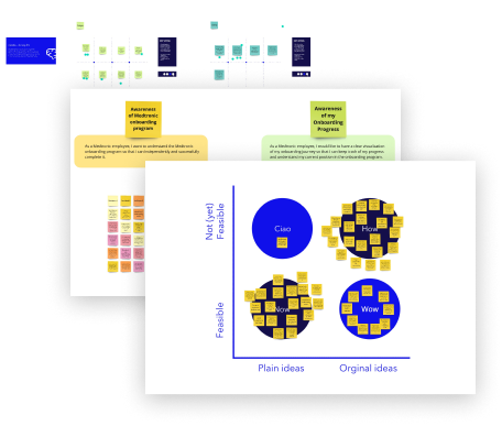
I led a two-part workshop to create solutions tailored to employees’ needs. The first part used Crazy 8’s to brainstorm ideas for the onboarding platform, while the second part used Brainwriting to refine these ideas, focusing on program awareness and onboarding progress.
Results
The brainstorming session generated ideas for designing an onboarding platform that helps users navigate the company’s onboarding process in a more engaging and interactive way. With these ideas, I began designing the platform using Figma.
Designing, Testing & Iterating
Designing & testing
the first concepts
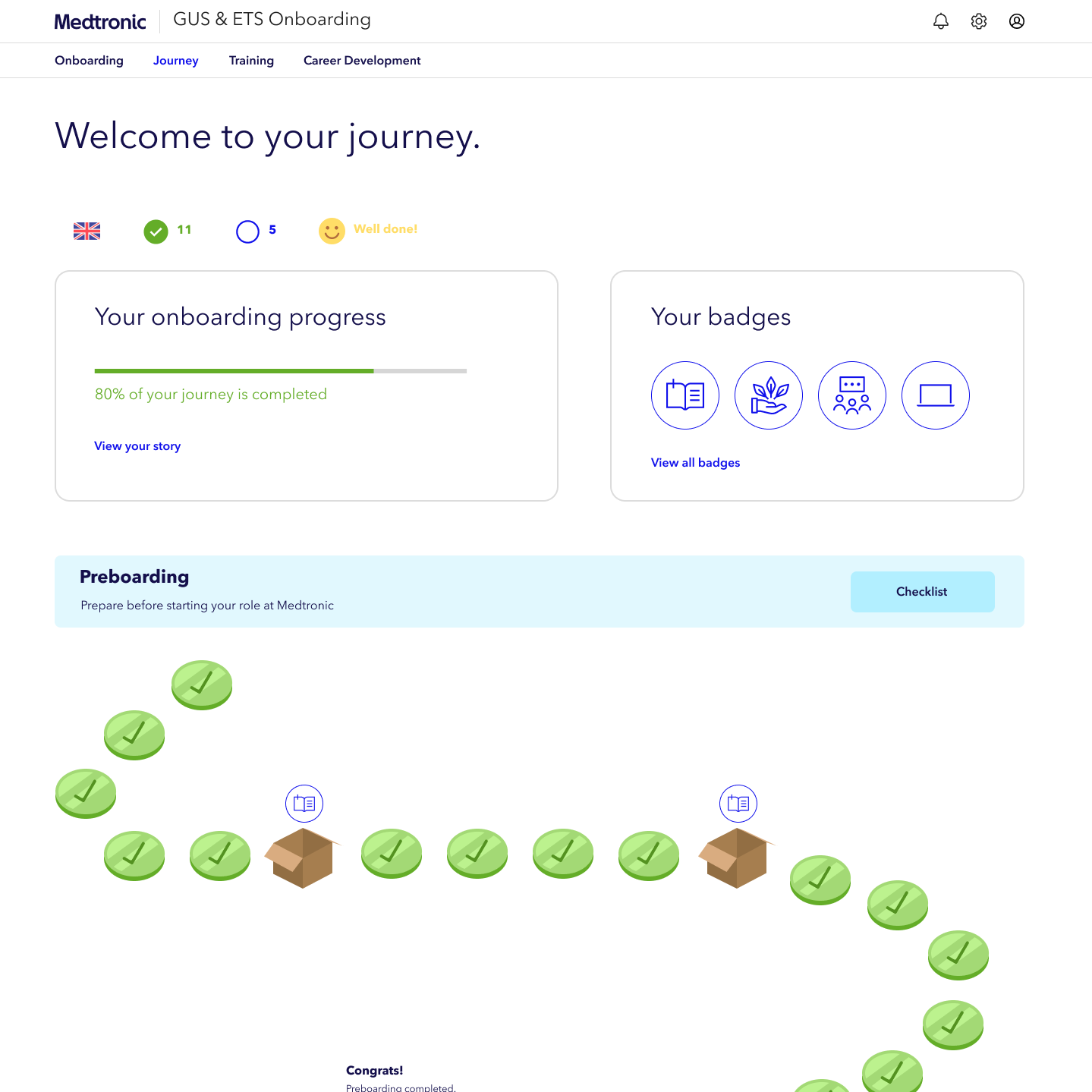
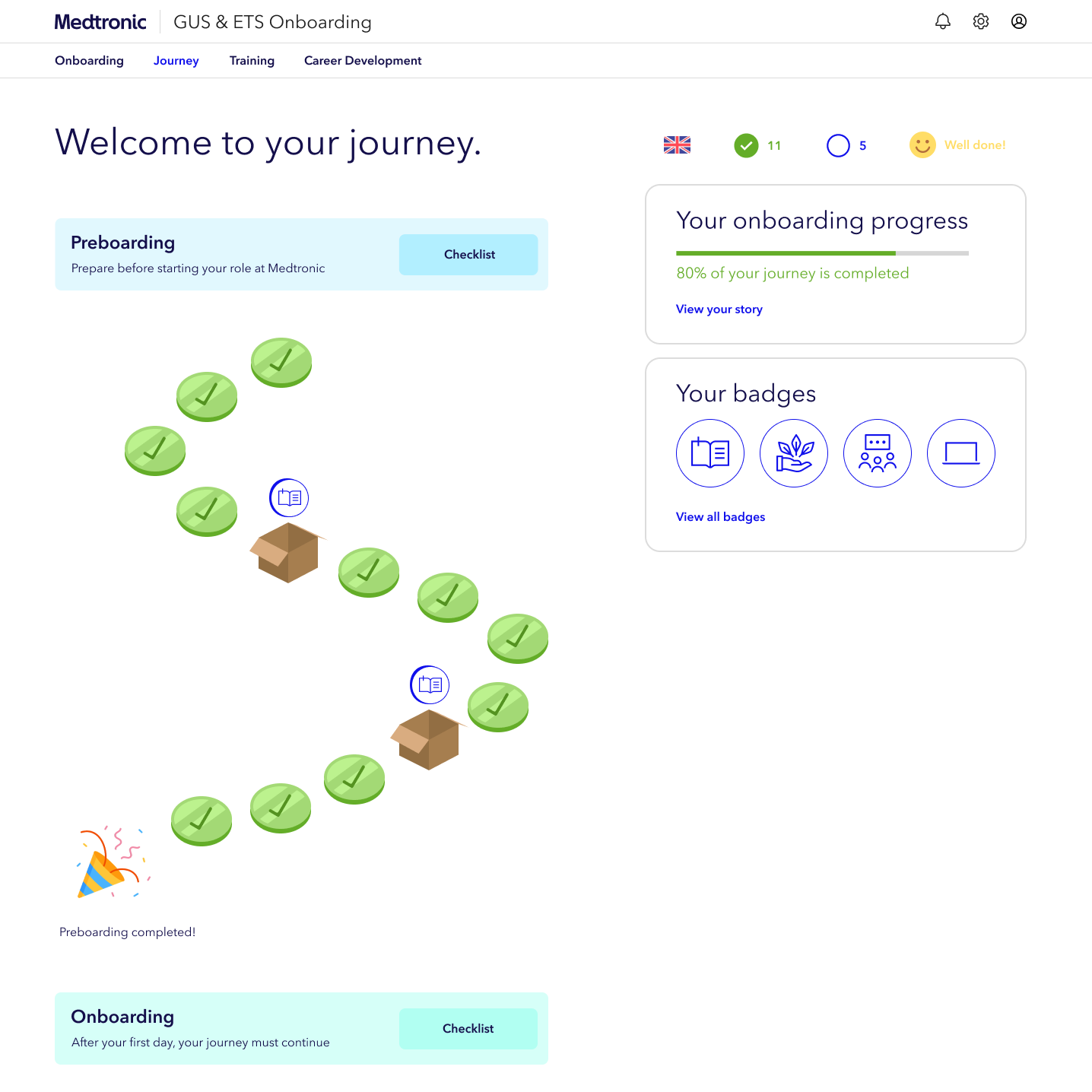
During the designing phase, my primary goal was to identify and implement user-friendly practices and design patterns that could be effectively applied to the prototype of the onboarding platform. I have developed an initial prototype containing two distinct approaches for the interactive onboarding journey: one presenting a broader journey on the screen while the other showing a more compact display.
General feedback
Predominantly positive, which affirmed the value of further developing this interactive approach for the platform.
“It’s easy to navigate, locate my tasks, and initiate or complete them.”
Employee
Awareness of onboarding progress
The onboarding journey improved the awareness of the users’ progress and the understanding of the onboarding program
“I like that I have in one place the tasks assigned to complete the process successfully.”
Employee
Prefered approach
Most votes favoured the approach featuring a more compact journey.
“The more compact journey is more comprehensible and user-friendly.”
Employee
Usability testing,
findings & iterations
I conducted a second part of a usability test with 5 new employees. I was looking to test clarity, completion and comprehension of the onboarding journey and their features.
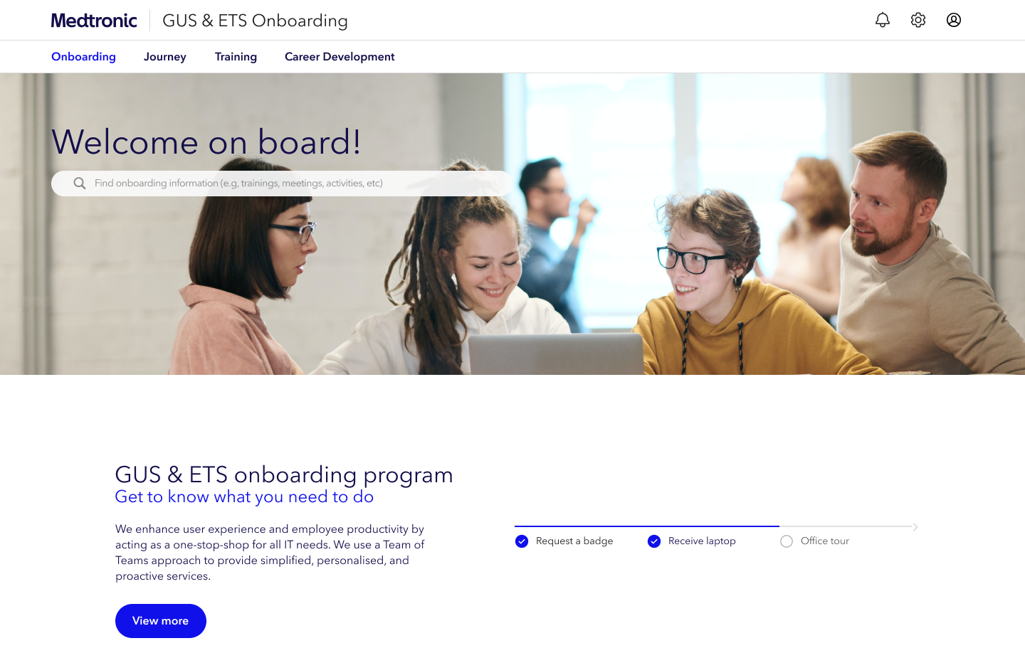
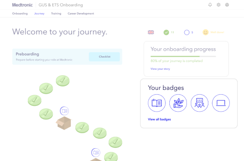
Before
The onboarding journey, despite being the platform’s standout feature, is not highlighted on the initial page.
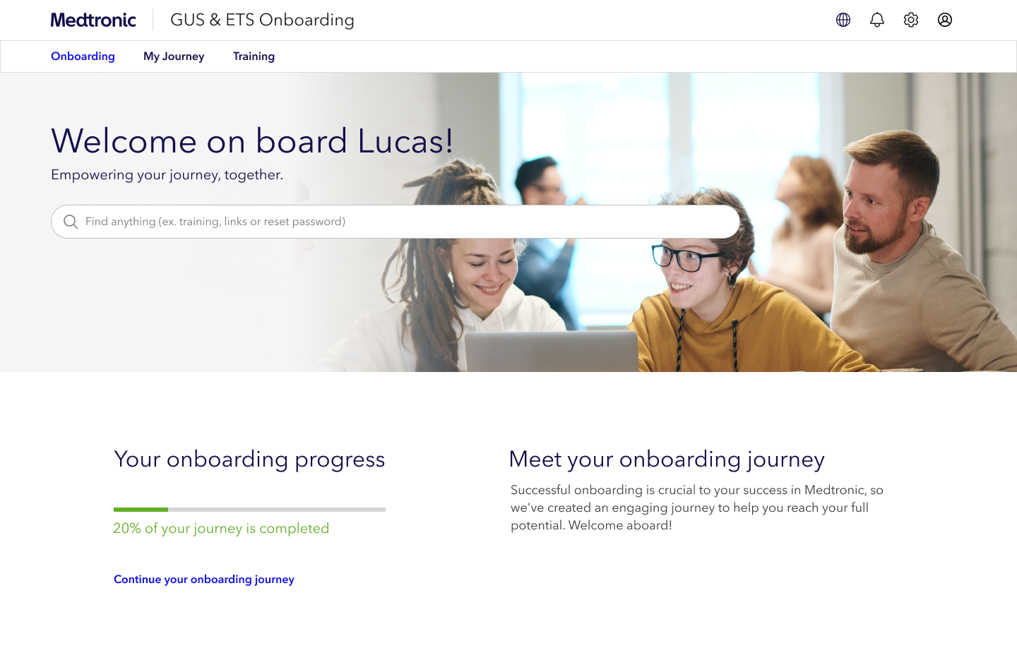
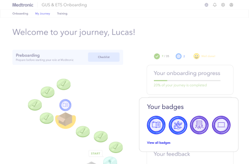
After
The interactive journey is now the first element presented to users, accompanied by minor design enhancements to improve its aesthetics and user experience.
Before
Users highlighted the importance of personalization by suggesting that the term “journey” be changed to “Your Journey”.
After
I changed the wording on the navigation bar to “My Journey” to enhance the sense of individual connection.
Before
Users suggested that icons could be more cheerful and fun.
After
I updated the badge styles to make them more appealing to users.

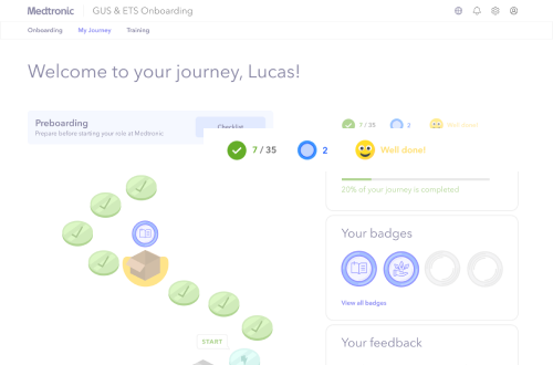
Before
Icons were inconsistent in the initial version of the design.
After
Based on user feedback and aiming for platform consistency, I undertook a redesign to enhance cohesiveness. This involved updating the icons and other elements.
